Formular One - or - How to style <select> elements
Remember those days where developers made the most amazing forms in Flash because they both had to do everything from scratch due to lack of being close to an operating system. And designers decided to put extra effort in looks in behaviour because of … design?
We took this pattern over to HTML sites and were close to recreating every single form element or adding JavaScript extravaganza, especially when we were doing <select> elements.
We had (good) jQuery plugins like Select2, who even were accessible and had lots of good extra features, but what we thoroughly missed was usability on those little buggers everyone has in their pockets: Smartphones.
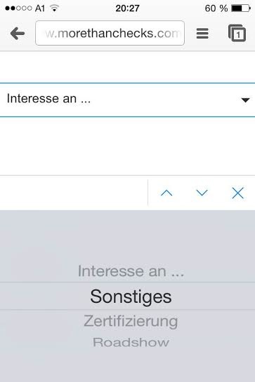
Smartphones do have extra controls and keyboards for different input types, and that is absolutely great! Different way of doing input requires to have different controls, so all those form elements got optimised in behaviour for your finger. Most of them popping up some wheel control in your keyboard area.


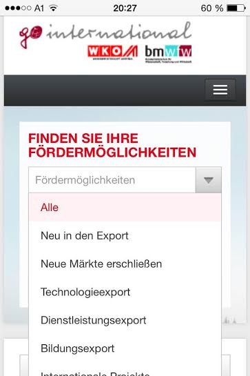
Native controls rock, even if they are ugly as hell as shown on iOS7! And while the control itself cannot be styled (Ive has to do that), we can style its origin: the select element.
Remove all the old styles #
First we remove the old styles we got onto from the operating system. Webkit and Gecko based browsers have a (prefixed) property for that, called appearance. With this property you can change the appearance to be a button, checkbox or whatever you like. In our case, we just say none to remove everything.
select {
  -webkit-appearance: none;
     -moz-appearance: none;
          appearance: none;
}
At the time of this writing, it is necessary to prefix it for both platforms.


Adding your own style #
Now you have control over the styles. In Chrome the select elements looks like “Ugly OSX Style, flatted”, whilst in Mozilla Firefox you get some sort of Windows-styled dropdown element.
Let’s focus on the Webkits for now. We just add some own styles as well as a background image for the drop down arrow.
select {
  -webkit-appearance: none;
     -moz-appearance: none;
          appearance: none;
  border: 1px solid black;
  background: url(..select.png) no-repeat 95% 50%;
  border-radius: 0px;
  font-size: 20px;
}
Getting rid of the drop down arrow #
Works perfectly on those platforms, we just have to get rid of the drop down arrow on Trident (Internet Explorer) and Gecko.
IE’s pretty easy on that, working with Shadow DOM, so you just can style the very element which renders the arrow.
::-ms-expand {
  display: none;
}
On Firefox though, we have to cheat a little. And that’s sad. With a combination of text-overflow and text-indent, we’re telling the browser to move the (perfectly fitted) text a little to the right, by one hundredth of a pixel. So the drop down box on the right gets also moved by one hundredth of a pixel, not fitting anymore into the select box. Then we tell the browser to cut off text (or in this case: arrows) by replacing them with a blank text using text-overflow.
select {
  text-overflow: '';
  text-indent: 0.01px;
}
And have the styled select box you ever wanted.

Disclaimer #
While this sample works at the moment, parts of it are rather hacky and thus might have a different outcome in the future. At the moment there isn’t a standard for styling native controls, so be aware that everything here might change!
Update #
As said, it is a hack. Therefore there might be some troubles with some browsers, like Firefox 31 and 32… it will work again with Firefox 33.
Further information #
This sample was part of my talk at the Webinale in June 2014. Get the whole slide deck here. See the whole example at Codepen.